Burger King Rebrand
- On February 23, 2021
Burger King Rebrand
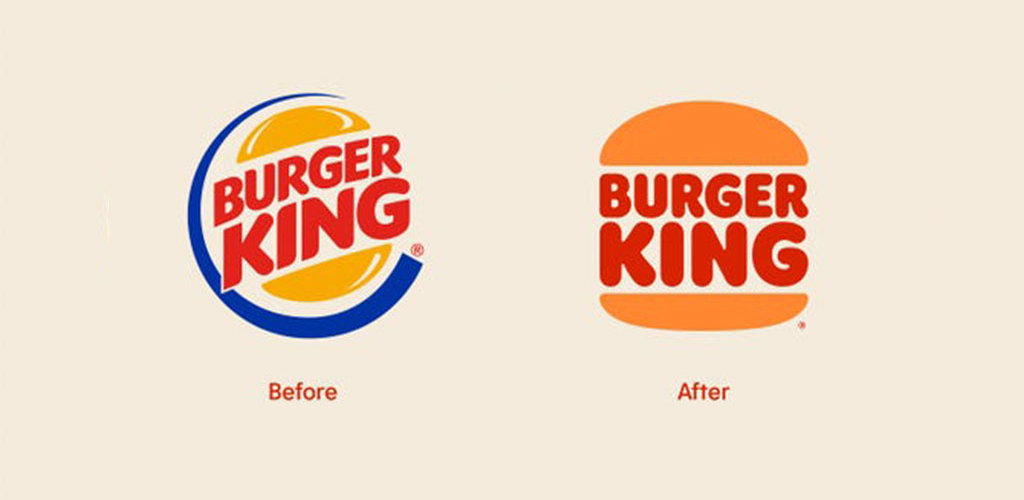
Burger King has its first rebrand in 20 years. The new logo design is more simple than the previous design. In this version, the restaurant name is between the two buns. The proportions and font were changed to give it a modern feel. Some fans mention that it looks like the 90s version of the logo (CLICK HERE TO TAKE A LOOK ). In addition to the logo rebrand, Burger King’s new look will be included in the packaging, menu boards, crew uniforms, and restaurant signage.
Burger King is smart in refreshing their logo even with people commenting the logo looks very similar to their 90’s logo. Any mention of their name is free advertising and gets their name out in the social media channels and helps build brand recognition.
Is your company ready to bring a fresh look to both your digital and print marketing material? FEA can update or enhance your current logo, or create a new logo. In addition, we can integrate all the elements of your marketing and advertising. Contact FEA today to discuss how we can update your marketing materials to create a visually appealing, contemporary appearance. Call us at 215-598-9870 or email us at inquire@fitzgeraldesplin.com.
Source: BusinessInsider.com]
Image: ©Burger King Corporation
